Skip to content

[SPFx] Form Customizer Boilerplate

Since the v1.15 of SharePoint Framework, we can (finally) customize list forms! Until now, the only customizable options were through PowerApps or limited to switch fields or display / hide them.

But actually, the customization leads to a gap with the native display, as clicking on "New" / "Edit" / "Display" redirects you to a dedicated SPFx hosting page. Even if there're plans to make custom forms available through the well-known side panel, I though it could be interesting to give a starting point solution, that would less impact users experience 🙂

It's also interesting to remind the existance of the ETag, which prevents concurrency updates on existing list items.

Prerequisites

  1. An Office 365 (Dev) Tenant or a Partner Demo Tenant
  2. SPFx 1.15 package (at least) installed on the local machine

The whole project snippet is available here.

For this example, we also use the following libraries:

For the package deployment & Content Type component association, we use the PnP PowerShell module.

Deep dive in code

Form customizer declaration

First, let's have a look at the init method:

 1
 2
 3
 4
 5
 6
 7
 8
 9
10
11
12
13
14
15
16
17
18
// ... (imports)

export default class FormBoilerplateFormCustomizer extends BaseFormCustomizer<IFormBoilerplateFormCustomizerProperties> {
  public async onInit(): Promise<void> {
  // ...
    // Init SPFx context for using PnPJs
    this._sp = getSP(this.context); // <== Declared in pnpConfig.ts
    this._pnpListItem = this._sp.web.lists.getById(this.context.list.guid.toString()).items;

    if (this.displayMode !== FormDisplayMode.New) {
      this._listItem = await this._loadItem();
    }
    else {
      this._listItem = {} as ISPEmployeeItem;
    }
  }
  // ...
}
 1
 2
 3
 4
 5
 6
 7
 8
 9
10
11
12
13
14
15
16
17
18
19
import {
  FormCustomizerContext
  } from '@microsoft/sp-listview-extensibility';

import { spfi, SPFI, SPFx } from "@pnp/sp";
import { LogLevel, PnPLogging } from "@pnp/logging";
import "@pnp/sp/webs";
import "@pnp/sp/lists";
import "@pnp/sp/items";

let _sp: SPFI = null;

export const getSP = (context?: FormCustomizerContext): SPFI => {
  if (_sp === null && context !== null) {
      _sp = spfi().using(SPFx(context)).using(PnPLogging(LogLevel.Warning));
  }

  return _sp;
};
1
2
3
4
5
6
7
8
9
export interface ISPEmployeeItem {
  Title: string;
  Description: string;
  Complete: boolean;
  Completeby: string;
  Completedon: Date;
  Mentor: { Id: string, EMail: string };
  Relevantlink: { Url: string, Description: string };
}

this.context, as we know it, contains know properties (because it's inheriting from BaseComponentContext) such as instanceId, pageContext,... But here as a FormCustomizerContext, we can get info related to the list context:

  • list
  • contentType
  • folderInfo
  • itemId
  • item (new to SPFx 1.16)
  • domElement

We also have list form context info, such as displayMode that let us know if we're in New, Display or Edit state (but this info is also in the URL as query parameter 😬).

So here, we are loading the list item if we're displaying an existing one, through the _loadItem method:

 1
 2
 3
 4
 5
 6
 7
 8
 9
10
11
12
13
14
15
16
17
18
19
20
21
22
23
export default class FormBoilerplateFormCustomizer extends BaseFormCustomizer<IFormBoilerplateFormCustomizerProperties> {
  // ...
  private _loadItem = async (): Promise<ISPEmployeeItem> => {
    const item = await this._pnpListItem
      .getById(this.context.itemId)
      .select("Title, Description, Complete, Completeby, Completedon, Relevantlink, Mentor/Id, Mentor/EMail")
      .expand("Mentor")();

    // Saving ETag for the update
    this._eTag = item["odata.etag"];

    // Removing unecessary data before passing list item to the component
    delete item["odata.type"];
    delete item["odata.etag"];
    delete item["odata.editLink"];
    delete item["odata.metadata"];
    delete item["odata.id"];
    delete item["Mentor@odata.navigationLinkUrl"];

    return item as ISPEmployeeItem;
  }
  // ...
}

Once our data loaded, we just have to push it to our Form customizer component!

 1
 2
 3
 4
 5
 6
 7
 8
 9
10
11
12
13
14
15
16
17
18
19
export default class FormBoilerplateFormCustomizer extends BaseFormCustomizer<IFormBoilerplateFormCustomizerProperties> {
  // ...
  public render(): void {
    // Use this method to perform your custom rendering.

    const formBoilerplate: React.ReactElement<{}> =
      React.createElement(FormBoilerplate, {
        context: this.context,
        displayMode: this.displayMode,
        theme: getDefaultTheme(),
        item: this._listItem,
        onSave: this._onSave,
        onClose: this._onClose
      } as IFormBoilerplateProps);

    ReactDOM.render(formBoilerplate, this.domElement);
  }
  // ...
}

Component

Now let's have a look at the component!

 1
 2
 3
 4
 5
 6
 7
 8
 9
10
11
12
13
14
15
16
17
18
19
20
21
22
23
24
25
26
27
28
29
30
31
32
33
34
35
36
37
38
39
40
// Imports...

interface IFormBoilerplateState {
  formListItem: ISPEmployeeItem;
  error: string;
}

const LOG_SOURCE: string = 'FormBoilerplate';

export default class FormBoilerplate extends React.Component<IFormBoilerplateProps, IFormBoilerplateState> {
  // ...
  constructor(props: IFormBoilerplateProps) {
    super(props);

    // Here, we receive list item data (if existing)
    this.state = {
      formListItem: this.props.item,
      error: "",
    };
  }

  // ...
  public render(): React.ReactElement<{}> {
    // ... (component content details declared here)
    return (
      <form onSubmit={this._onSubmitSaveItem} className={styles.formBoilerplate}>
        <CommandBar items={this._getCommandBarItems()} />
        <Separator className={styles.commandBarSeparators} />
        {this.state.error &&
          <MessageBar messageBarType={MessageBarType.error} onDismiss={() => {this.setState({error: ""})}}>{this.state.error}</MessageBar>
        }
        <Breadcrumb
          items={breadcrumb}
          className={styles.breadcrumbItem}
        />
        {formContent}
      </form>
    );
  }
}

In the return statement of the render method we got interesting stuff:

  • the form tag is used to control the required fields with native HTML5 behavior
  • the CommandBar, the Separator and the Breadcrumb controls placed here are for keeping consistency to the UX, as we're moving to the SPListForm.aspx SPFx hosting page

Let's keep scrolling down!

 1
 2
 3
 4
 5
 6
 7
 8
 9
10
11
12
13
14
15
16
17
18
19
20
21
22
23
24
25
26
27
28
29
30
31
32
33
34
35
36
37
38
39
40
41
42
43
44
45
46
47
48
49
50
51
52
53
54
55
56
57
58
59
60
61
62
63
64
65
66
67
68
69
70
71
72
73
74
75
76
77
78
79
80
81
82
83
84
85
86
87
88
89
// Imports...

export interface IFormBoilerplateProps {
  context: FormCustomizerContext;
  displayMode: FormDisplayMode;
  theme: ITheme;
  item: ISPEmployeeItem;
  onSave: (updatedItem: ISPEmployeeItem) => void;
  onClose: () => void;
}

interface IFormBoilerplateState {
  formListItem: ISPEmployeeItem;
  error: string;
}

const LOG_SOURCE: string = 'FormBoilerplate';

export default class FormBoilerplate extends React.Component<IFormBoilerplateProps, IFormBoilerplateState> {
  // ...
  constructor(props: IFormBoilerplateProps) {
    // ...
  }

  // ...
  public render(): React.ReactElement<{}> {
    // ...
  }

  // ...

  private _editItem(): boolean | void {
    const searchParams = new URLSearchParams(window.location.search);
    if (searchParams.has("PageType")) {
      searchParams.set("PageType", FormDisplayMode.Edit.toString());
      window.location.href = location.protocol + "//" + location.host + location.pathname + "?" + searchParams;
    }
  }

  // ...

  private _renderSaveButton = (item: ICommandBarItemProps): React.ReactNode => {
    return (
      <PrimaryButton
        type="submit"
        className={styles.commandBarItems}
        styles={item.buttonStyles}
        text={item.text}
        iconProps={item.iconProps} />);
  }

  private _saveItem = async (event: React.FormEvent<HTMLFormElement>): Promise<void> => {
    event.preventDefault();

    this.setState({
      error: "",
    });

    try {
      await this.props.onSave({
        ...this.state.formListItem
      });
    } catch (err) {
      let updateError: string;

      if (err?.isHttpRequestError) {
        const httpErr: HttpRequestError = err as HttpRequestError;

        // Handling the concurrency issue as working with ETag
        if (httpErr.status === 412) {
          updateError = strings.ErrorEtagMessage;
        }
        else {
          updateError = (await httpErr.response.json())["odata.error"].message.value;
        }
      }
      else {
        updateError = err.message || err;
      }

      Logger.error(err);
      console.log(updateError);

      this.setState({
        error: updateError
      });
    }
  }
}

A few other things to point out:

  • As the SPListForm.aspx hosting page needs context parameters (such as the PageType or the ID) to know what to display, the _onClickEditItem event redirects from the Display mode to the Edit mode
  • the _renderSaveButton method renders a PrimaryButton with the type attribute submit, which is crucial when working in a form context (and not declared as such by default in the Fluent UI component)
  • the _onSubmitSaveItem event triggered by the submit button mentioned before contains the event.preventDefault() statement, in order to not redirect the user (because it has to be handled by an inherited event declared in the FormBoilerplateFormCustomizer, we'll see about that later)
  • this method sends the updated form data to the host, which will perform the update operation and redirect the user to the list view or catching the error to display to him

Below the form customizer "as is" when initiated by Yeoman:
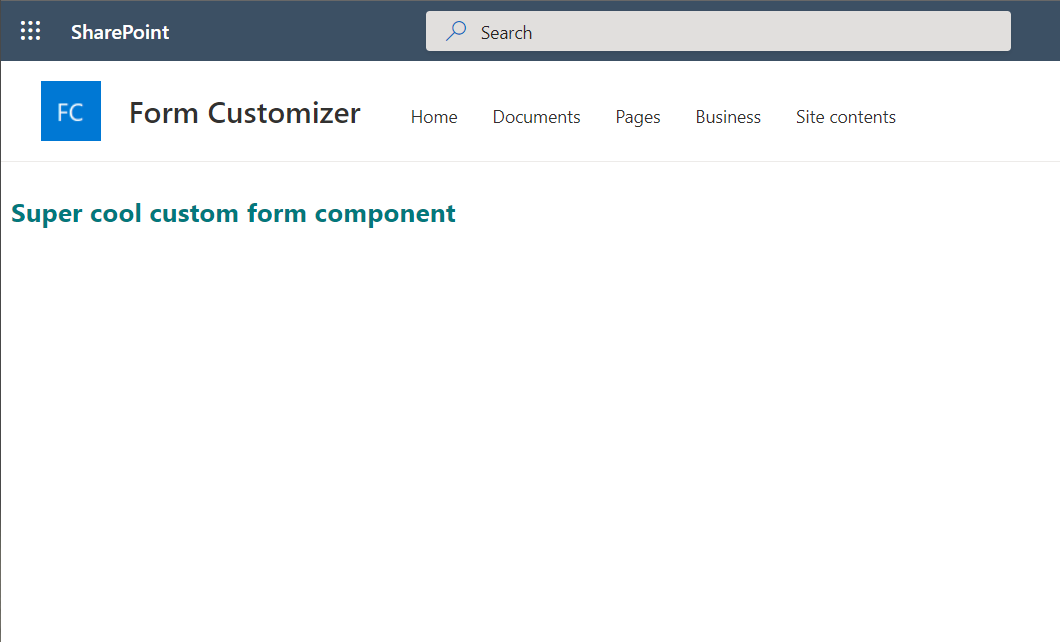
alt text

As we can see, the default display is really...empty! You can also see that the SharePoint App Bar isn't displayed here.

So the idea was to keep the same UI as the one we have in the list form:

alt text

Based on this, here's my proposal of Form customizer header:
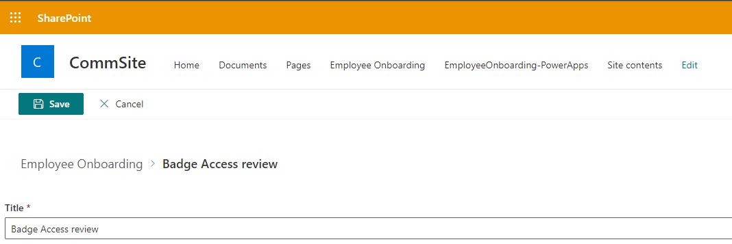
alt text

Now, back to the FormBoilerplateFormCustomizer host:

 1
 2
 3
 4
 5
 6
 7
 8
 9
10
11
12
13
14
15
16
17
18
19
20
21
22
23
24
25
26
27
28
29
30
31
32
33
34
35
36
37
38
39
40
41
42
43
44
45
46
47
export default class FormBoilerplateFormCustomizer extends BaseFormCustomizer<IFormBoilerplateFormCustomizerProperties> {
  private _sp: SPFI;
  private _pnpListItem: IItems;
  private _eTag?: string = "*";

  public async onInit(): Promise<void> {
    this._sp = getSP(this.context);
    this._pnpListItem = this._sp.web.lists.getById(this.context.list.guid.toString()).items;

    // ...

    return Promise.resolve();
  }
  // ...

  private _onSave = async (updatedItem: ISPEmployeeItem): Promise<void> => {
    let res: IItemAddResult | IItemUpdateResult;

    const item = {
      "MentorId": updatedItem.Mentor?.Id || null,
      ...updatedItem
    };

    // Remove the Mentor Field as loaded to avoid an "EntitySet error"
    delete item.Mentor;

    if (this.context.itemId > 0) {
      res = await this._pnpListItem.getById(this.context.itemId).update(item, this._eTag);
    }
    else {
      res = await this._pnpListItem.add(item);
    }

    if (!DEBUG) {
      this._onSaveNative();
    }
    else {
      // Save new ETag perform multiple savings in debug mode
      this._eTag = res.data.etag;
    }
  }

  private _onSaveNative = (): void => {
    // You MUST call this.formSaved() after you save the form.
    this.formSaved();
  }
}

Here, we got the following:

  • Cleaning the Person field info as SharePoint REST API expects a specific format when adding / updating it
  • Depending if it's a new or existing item, we add the known ETag to the request
  • When working locally on the component, using the DEBUG property is usefull, because when triggering the this.formSaved(), the SPListForm.aspx hosting page redirects to the site home page instead of the target list, which could be frustrating

A React control to rule them all

Since PnP SPFx Controls version 3.10, there's a new control called DynamicForm, which could perfectly fit to SPFx latest feature. Let's give a try!

 1
 2
 3
 4
 5
 6
 7
 8
 9
10
11
12
13
14
15
16
17
18
19
export default class FormBoilerplateFormCustomizer extends BaseFormCustomizer<IFormBoilerplateFormCustomizerProperties> {
  // ...
  public render(): void {
    // Use this method to perform your custom rendering.

    const formBoilerplate: React.ReactElement<{}> =
      React.createElement(DynamicFormBoilerplate, {
        context: this.context,
        displayMode: this.displayMode,
        theme: getDefaultTheme(),
        item: this._listItem,
        onSave: this._onSave,
        onClose: this._onClose
      } as IFormBoilerplateProps);

    ReactDOM.render(formBoilerplate, this.domElement);
  }
  // ...
}
 1
 2
 3
 4
 5
 6
 7
 8
 9
10
11
12
13
14
15
16
17
18
19
20
21
22
23
24
25
26
27
28
29
30
31
32
33
34
35
36
37
38
39
40
41
42
43
44
45
46
47
48
49
50
51
52
53
54
55
// ... (imports)
interface IDynamicFormBoilerplateState {
  error: string;
}

export default class DynamicFormBoilerplate extends React.Component<IFormBoilerplateProps, IDynamicFormBoilerplateState> {

  constructor(props: IFormBoilerplateProps) {
    super(props);

    this.state = {
      error: "",
    };
  }

  public render(): React.ReactElement<IFormBoilerplateProps> {
    return (
      <div>
        {this.state.error &&
          <MessageBar messageBarType={MessageBarType.error} onDismiss={() => { this.setState({ error: "" }) }}>{this.state.error}</MessageBar>
        }
        <DynamicForm
          /* eslint-disable-next-line @typescript-eslint/no-explicit-any */
          context={this.props.context as any}
          listId={this.props.context.list.guid.toString()}
          listItemId={this.props.context.itemId}
          onSubmitted={this.props.onSave}
          onCancelled={this.props.onClose}
          onSubmitError={this._handleSPError}
          disabled={this.props.displayMode === FormDisplayMode.Display} />
      </div>
    );
  }

  // eslint-disable-next-line @typescript-eslint/no-explicit-any
  private _handleSPError = async (listItemData: any, error: any): Promise<void> => {
    let updateError: string;

    if (error?.isHttpRequestError) {
      const httpErr: HttpRequestError = error as HttpRequestError;

      updateError = (await httpErr.response.json())["odata.error"].message.value;
    }
    else {
      updateError = error.message || error;
    }

    Logger.error(error);
    console.log(updateError);

    this.setState({
      error: updateError
    });
  }
}

As we can see, it's shorter than the first approach! With a "few" lines we have a ready-to-use Form customizer!

But we notice that:

  • there's neither CommandBar, Separator or Breadcrumb components, since the Save and Cancel buttons are part of the DynamicForm component, we can't hide them or overriding them
  • we can't handle the ETag here, as the component doesn't have a prop which allows us to specify it
  • the saving and cancelling events are handled by the component (through the onSubmitted and the onCancelled event props)

Th advantage of this component is that it handles the list context, so that the fields are displayed accordingly to its host (with associated configuration for each of them). But we're limited into the UI (even if there's a render overriding method called fieldOverrides), especially if we want to keep existing parts like the CommandBar.

Deployment

In order to deploy our Form customizer properly, below the script used to deploy the solution to the tenant app catalog and associate the component to the list content Type.

Info

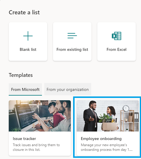
The list used here is the Employee onboarding template provided by Microsoft when creating a list: alt text
 1
 2
 3
 4
 5
 6
 7
 8
 9
10
11
12
13
14
15
16
17
18
19
20
21
22
23
24
25
26
27
  # Connecting to Tenant App Catalog (but could be also a Site Collection App Catalog)
  Connect-PnPOnline -Url https://contoso.sharepoint.com/sites/appcatalog -Interactive

  # Deploy the SPFx package to the Tenant App Catalog
  Add-PnPApp -Path "[PATH_TO_YOUR_SPFX_PACKAGE]" -Scope Tenant -Publish -Overwrite

  Disconnect-PnPOnline

  # Connecting to the target site where the component will be added
  Connect-PnPOnline -Url https://contoso.sharepoint.com/sites/hr -Interactive

  # Adding the solution to the site
  Get-PnPApp -Identity 0f850be3-9749-4726-9a75-06a89e6f231d | Install-PnPApp

  # Form customizer component id
  $customFormComponentId = "8b38fd0b-2722-4001-acc0-5fddb5bc4c50"

  # Getting the list default Content Type (but could also be a Hub or a Document Set one)
  $listCT = Get-PnPContentType -Identity "Item" -List "/lists/EmployeeOnboarding"

  # Linking the component to the different form contexts
  $listCT.EditFormClientSideComponentId = $customFormComponentId
  $listCT.NewFormClientSideComponentId = $customFormComponentId
  $listCT.DisplayFormClientSideComponentId = $customFormComponentId
  $listCT.Update(0)

  Invoke-PnPQuery

And that's it! From this boilerplate, you should be able to start playing with the Form Customizer!

Happy coding! 😄